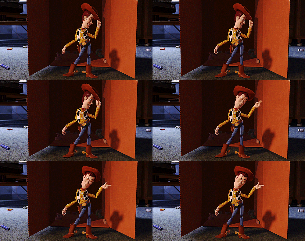
In creating the main characters for Toy Story, the animators were interested in relating the characters to current pop-culture icons such as the cowboy, the astronaut and the American idea of the frontier. Lasseter noted "because of the popularity of Jurassic Park, we knew we had to have a dinosaur." Lasseter also explained that, originally, Buzz was supposed to be named Lunar Larry and was supposed to be more of a silly character. With Tim Allen's vocal performance, they then decided to switch Buzz to a more bossy type character. This was when it first became the typical trend for Pixar to use TV stars, movie stars and singers as lead roles in their animated films. This offered familiar voices to the audience, and made the films even more lovable for fans. This is shown when Tom Hanks played the voice of Woody, and brought warmth and sincerity to the character. This is probably because he had stared as classic, lovable roles such as in Forest Gump, Splash, Big and Sleepless in Seattle.
https://media.giphy.com/media/UeQRyYEGLtvrO/giphy.gif
As the character of Woody was being developed, the animator Jeff Pidgeon originally designed and sketched him to be more troubled looking and comical than the final draft. Interestingly enough, Pixar used more famous actors as their voice actors in their earlier films than they do now. Now, their name has become more famous and more popular and use of famous actors in their movies is not as necessarily important.
Works Cited:
Clarke, James. The Films of Pixar Animation Studio. Kamera Books, 2013.
Tuesday, November 28, 2017
Behind the Scenes of Toy Story
The goal while creating the animation of Toy Story was to create something new and unique, along with something familiar. One of the challenges the animators faced was creating believably illuminated and shaded surfaces, such as animal fur, bedclothes and surface textures of the toys.
As you have probably noticed, Toy Story characters all have a very shiny look that reflects light. This was no mistake! This was a common and smart decision by the animators because at the time, plastic-looking surfaces were easily achievable on the computer. The first time that Pixar was able to create a believable illusion of human skin was in 2004 when The Incredibles came out.
In Toy Story, the writing team consisting of Joss Whedon, Pete Docter, Andrew Stanton, Joel Cohen, Alex Sokolow and Joe Ranft, constructed the movie's storyline. The screenplay development happened at the same time that the animators were starting to create the characters. The way the team created the film helped them figure out how to best connect the dialog to the characters and artwork they created. Once the team began to narrow the focus of the screenplay, they began the process of mapping out the story by using hand-drawn storyboards. This way, drawings and painted character designs were also used as the basis for the sketch of the characters which were then scanned on the computer.
When they started to create the screenplay, some elements of the story naturally had to be cut out. Pixar then used some of these elements for later films, as they do often. An example of this is when Toy Story was supposed to have opened with a Buzz Lightyear cartoon. Because this prologue was abandoned, the animators added this to the begging of Toy Story 2.
During Toy Story's production, Disney kept bugging them about adding the eight musical numbers they had suggested they added, to where the characters expressed their hopes and fears. Pixar explained that they just preferred to use dialog to communicate the character's feelings. John Lasseter, part of the animating team explained; "we wanted to create a sense of nostalgia for the adults in the audience." Pixar's films are usually created using bright and radiant colors. For Toy story, they were influenced by the American painter Maxfield Parrish, who was famous for his hyperreal paintings, which appeared to shine with an "inner glow."
Works Cited:
Clarke, James. The Films of Pixar Animation Studio. Kamera Books, 2013.
Wednesday, November 15, 2017
Attempt at Realism
Finding Nemo
Along with many of the other Pixar films, Finding Nemo involves bright and uniquely styled animation technique. During the making of this movie, the animators faced the challenge of finding new ways to make fish as expressive as possible. Their goal was to make them look appealing and loveable, while also paying attention to the physical and optical laws of nature.
In order to represent life under the sea in a realistic way, the animators in Finding Nemo constantly paid attention to creating a sense of density, distance and the use of sunlight. When the movie came out, in May 2003, John Lasseter commented that "Our only challenge was to let the audience know that our ocean is caricatured. We wanted them to know that this wonderful world doesn't exist, but then using the animation tools that we have in computer animation make it look totally believable. Our goal is always to make things believable, not realistic. By stylising the design of things, adding more geometry and pushing the colours, we were able to create a natural and credible world for our characters."
Finding Nemo is beautifully animated with pastels, while it also makes attempts at making the fish look as real as possible. The backgrounds in the movie are equivalent to the wilderness backgrounds in films such as Princess Mononoke and Bambi. Ralph Eggleston was the film's production designer offered some first hand insight; "One of our first priorities was to make the fish seem appealing. Fish are slimy, scaly things and we wanted to make the audience love our characters. One way to make them more attractive was to make them luminous. We ultimately came up with three finds of fish- gummy, velvety, and metallic. The gummy variety, which includes Marlin and Nemo, has a density and warmth to it. We used backlighting and rim lights to add to their appeal and take the focus off their scaly surface quality. The velvety category, which includes Dory, has a soft texture to it. The metallic group was more of the typical scaly fish. We used this for the schools of fish."
Pixar also uses lighting and shading to create the allusion of realism. Dylan Brown, the supervisor of Finding Nemo, commented that; "another big factor was timing. With characters like Buzz, Woody or Sulley, you have an earth-based gravity. But fish underwater can travel three feet in a flash. You blink and the thing is gone. We were wondering how they did that and studied their movements on video. By slowing things down, we could figure it out. Our timing for very crisp as we learned how to get our fish characters from one place to another in the course of a frame or two. We always tried to incorporate naturalistic fish movements into the acting. By putting things like one-frame darting and transitioning from one place to another into our acting, the characters became very believable."
Clarke, James. The Films of Pixar Animation Studio. Kamera Books, 2013.
m.popkey.co/e941b2/9ezee.gif.
78.media.tumblr.com/b3fb5c0ae282d2c508ff1f0394a18a2b/tumblr_o9lboawcSU1vn1j1jo1_500.gif.
www.givegab.com/blog/wp-content/uploads/2016/04/nemo.gif.
Subscribe to:
Posts (Atom)